Packaging design is one of the key components of a company’s brand identity. For a new customer, it’s probably the first time they interact with your company. But what does great product packaging look like? We compiled a list of some of the top packaging designs from 10 brands that took great care in making their product show up brilliantly.
How did we decide which product packages made the list? We looked at a few key things:
Overall appeal - i.e. how attractive the packaging looks.
Branding - how well the packaging design translates the brand’s image and values.
Practicality - how practical the packaging is, in relation to the product itself.
1. Apple - the pioneer of minimalism
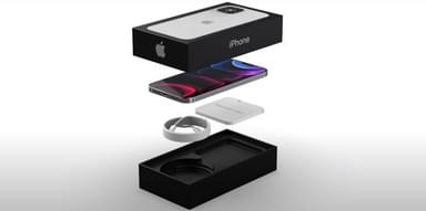
Clean, elegant, simple and sophisticated - these are the qualities that define Apple. And they are visible in the brand’s product packaging design.
Apple is an expert at making unpacking a true sensory experience (think of the satisfying feeling you get when you remove the film off your new Apple device), and they always stay on the lookout for the latest design trends, or necessary adjustments.
One adjustment that Apple has made is when it comes to sustainability and sustainable practices. To reduce the amount of waste that comes from every Apple product, the brand first focused on its packaging. One of the most radical decisions they made last year was removing the charging block and AirPods that usually came with the box. The company has also started using more fibre-based and recyclable materials like paper to cover the devices.
Why we think their packaging works:
It carries the brand message - Apple motto is “think different”, and their unique packaging depicts that message.
It’s practical - despite having minimalist packaging, the product inside it is contained very well to hold up during transportation.
2. Coca-Cola - the creator of the iconic shape
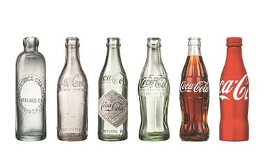
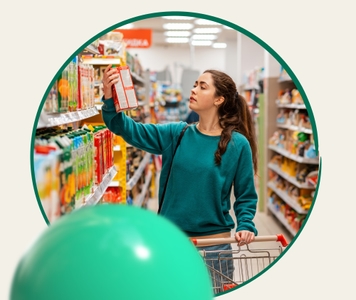
When you look at the drinks shelf in any supermarket, you will likely find Coke’s bottles in the first 10 seconds. That’s the power of brand design.
That level of brand recognition is something that Coke was determined to achieve from the beginning. When the company was briefing The Root Glass Company back in 1915, they asked for a package that was “so distinctive that it could be recognized by touch alone, and so unique it could be identified when shattered on the ground.”
And The Root Glass Company did their homework. Even though the bottle has changed its shape over 135 years of the company’s existence, its defining features, for the most part, stayed the same. The contoured lines, the cursive font, and the curved shape became integral to Coke’s product packaging.
Why we think this packaging works:
It’s iconic - Coke has shown that you don’t need to reinvent the wheel to create good packaging; the contoured bottle is as eye-catching as it was a century ago.
It always gives room for experimentation - because the bottle is so simple in shape, the brand did so many redesigns and experiments with their packaging. Even after the company decided to start using recycled materials, its packaging design didn’t experience major changes.
3. Trident Gum - out-of-the-box-thinker
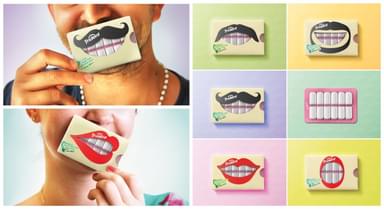
Back in 2014, Trident launched Trident Xtra Care, a new line of sugar-free gum. They hired an award-winning art director, Hani Douagi, to develop a creative packaging design. And Hani did just that!
Douagi explains:
I created a new playful and interactive packaging which enhances the main feature of the product “Protecting Teeth”. A range of Six packs that represent three flavors, each pack has an illustration of a mouth with either moustache or lips. The chewing gum looks like teeth through the mouth die-cut window. The Blister chewing gums is designed to look like a set of bright teeth on pink gums.
The art director’s work was praised: Trident Gum’s brand packaging got global design awards in Germany (iF Design Award 2015) and the US (the Dieline Award 2015), the design project was featured in Chicago’s How Design Life 2015 exhibition and many creative networks.
Why we think this packaging works:
It’s so simple and yet, so creative - as we learned from Apple, the less - the better. Trident’s design is minimalistic, fun and, most importantly, does a good job of housing the product.
It highlights the product - it’s often easy to forget that what makes packaging great is that it makes the product its centrepiece. The mere fact that Trident gum represented protected teeth (which is literally its functional purpose) put this pack into our best packaging designs list.
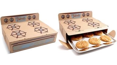
4. Thelma’s Treats - grandma’s love in a box
People love nostalgia. And when the brand delivers on nostalgia with a great product and high-quality packaging, things work out just fine.
Thelma’s Treats is a family-owned business in Des Moines, IA, that makes and delivers cookies, ice cream sandwiches, milk, and coffee. Dereck Lewis, Thelma’s great-grandson and owner of the company recalls: “... it really became, how do we convey that sense of joy of getting warm cookies from Grandma?”
So Lewis decided to convey that warm memory of his Grandma’s cookies through his product packaging. The cookies are housed in a carton box that resembles a 1950’s oven, just like Grandma Thelma’s. This packaging just screams “homemade”!
Why we think this packaging works:
It’s innovative - not every cookie business gets as creative with their packaging as Thelma’s has here. Not only does the packaging ensure customers won’t get broken cookies (nobody likes broken cookies), but they’re also transported back in time to when they might have eagerly anticipated warm cookies coming out of the oven.
It’s sentimental - everyone loves the smell of freshly baked cookies. It’s associated with childhood and better times. Thelma’s Treats food packaging plays on that memory well.
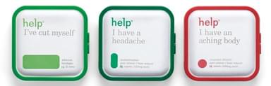
5. Help Remedies - speak directly to the target audience
About 10 years ago, when you didn’t feel well, you’d go on Google and type something like “flu symptoms”. But today, search became more related to user intent, i.e. instead of looking for flu symptoms, you’d ask Google “I have a headache, what do I do?”.
Help Remedies, a pharmaceutical company that specializes in over-the-counter drugs, blew up on social media when they launched their “simplified” product packaging.
Pharma is an industry that uses complex terminology and isn’t very expressive in terms of graphic design. But Help Remedies thought otherwise.
With the mission of “making solving simple health issues simple”, the company asked their branding agency Pearlfisher to create a new look for their packaging to carry that message.
The colourful packs feature a simple statement that revolves around a specific problem like “Help. I’ve cut myself”. The packaging is also made of recycled materials like moulded paper, pulp, and bioplastic.
Why we think this packaging works:
It’s aligned with human behaviour - how often do you find yourself Googling why your stomach hurts and finding out that you may have some difficult-to-pronounce incurable disease?
It’s empowering - taking care of your health can feel stressful and scary. Help Remedies wants to eliminate that feeling and empower you to make your own health decisions through simpler language and simpler medicine.
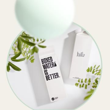
6. Boxed Water Is Better - sustainability in every drop
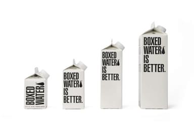
Sustainability is should and does make up the core of many companies’ brand strategies. Some companies develop collection and recycling systems (e.g. Nespresso recycles your used pods), others focus on adjusting the packaging materials to improve the long-term environmental impact. Boxed Water Is Better is in the latter category.
What makes Boxed Water different is that the brand serves up their water in entirely sustainable packaging. Ever since their inception in 2009, the company has been offering a great alternative to bottled water thanks to its unique cardboard box that’s made with 92% renewable materials.
Why we think this packaging works:
It’s sustainable in more ways than just it’s packaging - transporting carton boxes has a much lower carbon footprint than plastic bottles. Boxes can be shipped flat in fewer trucks and refilled locally before being distributed.
It speaks to Boxed Water’s brand strategy - besides producing recyclable packaging, Boxed Water’s strategy is to give back to the planet. The company helps non-profit organizations such as the Ocean Blue Project and the National Forest Foundation clean beaches and plant trees.
We hope this list of top packaging design examples inspired you to begin mocking up your first product package or rethink your current packaging.