The famous siren, who sits seductively at the centre of the Starbucks cup, defines the brand today. The Starbucks logo is synonymous with more than tasty coffee, it’s about the entire experience of getting one and drinking one. When someone walks by with the logo emblazoned on the Starbucks coffee cup, there are associations made around people’s backgrounds and lifestyles.
There is something mysterious and yet simple in the Starbucks siren’s face, but it’s a fact that every day she lures millions of coffee lovers into Starbucks stores.
Want to learn about some other successful brand logos? Check out this post.
The History of the Starbucks Logo
The development of the coffee maker's logo was tied closely to its long history. Established in 1971 by a group of friends and coffee aficionados, Gordon Bowker, Jerry Baldwin, and Zev Siegel, Starbucks originally sold mainly coffee beans and coffee-making equipment. But since then, the company underwent some large ownership changes, which affected both its products and logo. Let’s see how it happened.
From sea creatures to selling coffee
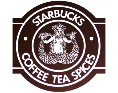
Since the company was established in Seattle, the owners took great inspiration from the city’s maritime history while they were designing the logo (the brand's name, after all, got inspiration from Moby Dick). The original Starbucks logo in 1971 was black and white (and later brown) and featured a two-tailed mermaid on the walls of Starbucks coffee shops, encircled by the name of the company “Starbucks: Coffee, Tea, Spices”.
The idea behind the logo was that it was believed that sirens lured sailors with their beautiful voices to a shipwreck off the coast. Drawing on this as inspiration, the founders wanted to give off the idea that Starbucks seduces coffee lovers.
Mermaids and Roman Gods
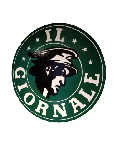
Starbucks needed some help with marketing, so they hired Howard Schultz. Off the back of a trip to Italy, Schultz was inspired by the country’s coffee culture, suggesting that the Starbucks team begin selling espresso-based drinks. But the founders didn’t take to this idea, and Schultz ended up leaving the company and starting his own business, Il Giornale.
Il Giornale’s green logo was quite similar to Starbucks’, portraying the Roman God Mercury, who represented speed and efficiency.
The new beginning
Right before 1987, Starbucks’ co-founder Zev Siegel left the company. Having struggled to come to an agreement about where the brand was going, Bowker and Baldwin decided to sell the company to Schultz, which is when a lot of big changes began.
Terry Heckler was the original Starbucks logo’s creator. To represent the merger of the two companies and the growth of Starbucks as a brand, Heckler united the two logos. He redesigned the mermaid’s appearance, making it more refined and modern. The bare-breasted siren was considered to be too revealing, which is why Heckler covered her body with luscious long hair. The brown colour scheme was dropped and replaced with Il Giornale’s fresh green. The name also changed to, simply, “Starbucks Coffee”.
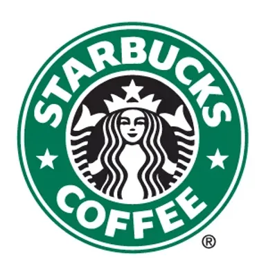
In 1992, the logo changed again, the mermaid’s face got up close and personal. Starbucks’ logo designers cropped out her navel, but kept the tails on her sides. This new logo remained unaltered until 2011.
All her perfect imperfections
In 2011, the company decided to remove its name from the logo and let the mermaid appear on her own.
Schultz commented on the change: “We’ve allowed her [the mermaid] to come out of the circle in a way that I think gives us the freedom and flexibility to think beyond coffee”. The logo demonstrates Starbucks’ evolution as a brand - at this point, it’s a brand that doesn’t need the brand name to visually signal what they sell - it’s a household name. On top of that, the brand doesn’t want to limit itself, which we’ve seen through its extensive food and beverage ranges.
What’s interesting to note is that the siren herself also had some changes. When the team of designers created the new logo, they wanted to make the mermaid’s face perfectly symmetrical to demonstrate the unequivocal beauty of the mythical creature. But soon they realized that she looked too symmetrical, to the point that it verged on “creepy”. Consequently, one of the mermaid’s eyes got a slight shadow, which gave her a sense of asymmetry. The designers explain that this “imperfection” helped the siren look more approachable and human.
It’s fascinating to track how the logos of famous brands and companies have changed through the years. The history behind the brand, and the evolution of the Starbucks logo, show that a well-designed visual brand and logo can contribute to a brand’s future success.